

This page is gonna be strictly dedicated to some projects I have done in school for my Graphic Design/Advertising Portfolio:
A project for "Branding Myself" graphically and textually in my Spring 2016 class called Principles of Advertising.
Summary of Assignment:
Remember your "Me In A Nutshell" assignment at the beginning of the class? You had to use visuals to describe who you were--your personality, your experiences, your ideals, your beliefs.
Many of you created a collage of photos, each one representing the intricate layers that make up the whole of who you are.
Products are like that. They have all kinds of features and characteristics. It's easy to list all of them. Problem is, not all of those are permanent or important, or valuable to the consumer. To truly capture a product's brand, the superficial has to be stripped away. Relentless reductionism leads to the single core idea that is the brand's truest asset.
So, treat yourself like a product. You now need to strip away all the layers until you get to the single, truest thing about who you are at your very core. It's not your dog. Or your BFFs. Or a band. Those things are not permanent. You were someone before you loved that band, or that BFF. And your dog is not going to live forever. (Sad, but true!)
Where is the place? What is the thing? What is the ideal? that sums up who you are in the past, now, and into the future?
Really think about it. And then, create a one-page ad about yourself.
Brand you.
You will:
Find a visual that captures your essence and write a headline that starts the story (1 point)
Then, write the explanation in the form of ad body copy (1 point)
Sign it off with a logo (your name) and a slogan (your war cry) 1 point

Feedback from Professor:
"Oh, it's very right. This is great. And it it so nice to meet another writer. May words always bring you solace. Print this out and keep it somewhere so years from now you can look at. You will be glad you did."

A project for "Making a Print Ad" graphically and textually in my Spring 2016 class called Principles of Advertising.
Summary of Assignment:
You may not do an ad for anything you want. You have been assigned the product Slim Kitty. So do an ad for that. (You would be amazed how many students don't get that.)
An experimental logo concept I created digitally for an English-themed club. I was considering getting into tutoring and hosting an after-school kids "tutoring club" and using my talents, I created this piece.


Feedback from Professor:
"Very nice job. I love the what you did your name. The images tell a great story."
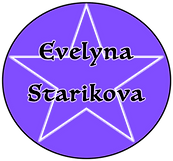
A project for "You In A Nutshell" graphically and textually in my Spring 2016 class called Principles of Advertising.
Summary of Assignment:
This is part one of a branding assignment. You will do the second half near the end of the course.
VALUE: 2 points
MUSTS: 8.5" x 11," computer generated. Must include your name, and there are no words other than your name on the page. You may use a nickname. (Yes, a picture of a quote that means something to you is okay.)
RUBRIC:
Visually demonstrate your values, your personality, your identity (1 point)
Project management (attempted to or successfully uploaded the file 48 to 24 hours before the deadline) (1 point). Upload a photo, a word document--and it doesn't have to be part of your project. Why? Because you need to know how to upload this before you are trying to finish the assignment at the last minute, and then can't do it, and send me an email begging me to accept it by email. Practice. Upload a file, any file, just so you know you can do it when you complete your project.
This is a graphic edit made digitally for the NHL: All-Stars Event that was scheduled to be in Tampa, FL. This was a fun edit that I thought came out very neatly and beautifully.


This is a piece of art that I volunteered to create, using the group's logo at the time for a fan-page cover on the social media website, Facebook. It was well-received and used.
This is a logo graphic I made for another fan-group for the sport of hockey. This is for a podcast/twitter group called "Crash", they give excellent timely updates about the sport, mainly covering all teams in the NHL, posting who scored and which team won as well as presenting polls for who would win the matchup for the game series.


This is another experimental, fun piece I made from an idea in my head. Quite a few people really like it and say that it looks quite realistic.
This is a piece of work, one of my very first SERIOUS pieces of work I made digitally. It is still one of my favorites, with the color scheme blend, the dramatic aspect as well as the layers within the actual piece itself.


This is another well-received graphic I made of my favorite four players from my favorite 2 teams (at the time). Boy, we've come a LONGGGGGGGG way since then. Ha-ha.
Nevertheless, this piece is stunning to look at and one of my favorites I've made. Very professional looking.
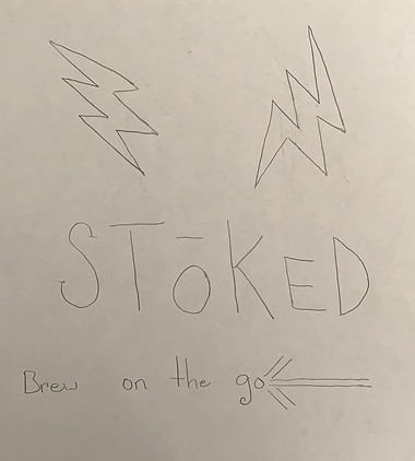
A Print Ad Assignment for the Stok Cold Brew Coffee Brand I made for my Advertising Creativity Class during the Fall of 2019.
I am currently pursuing a second Bachelor's degree in Integrated Public Relations and Advertising at USF.


Summer 2020 -- July 8th, 2020
This is the cover of a graphic design collection book on the site, Wattpad. I am hoping to venture out and challenge myself with some side projects as well as aiding other writers who might not be as artistically inclined as I am but have beautiful stories to tell and need a decent cover to use.
Fall 2020 -- September 5, 2020
This is a book cover I made for a Wattpad user named "Thumb_Magnet." They had Direct Messaged "DMed" me with the request to make a cover, giving me a few key guidelines to follow when making it, such as the color theme and what the book was about, as well as the title.


Fall 2020 -- September 26, 2020
These are a series of graphic edits I designed via photoshop for a co-owned Wattpad account with my friend, Katt. Two were choices for the cover image and two were used for the proflie image. The red-ombre background square image is currently being used as the profile picture for the page.
Winter 2020 -- December 17, 2020
This is ta fun logo design I made in Illustrator.


Summer 2021 -- June 10, 2021
These are a series of logo designs I crafted for my best friend/roommate's work training class. I was sent the logo, a cap and told basic instructions for what they wanted as the visual. I also created a cover for their Webex page.
Instructions:
1. Can you design an image with the T-Mobile logo, put a graduation cap on the corner of the logo (doesn't matter which side of the "T") and "M.O.E." along the side (doesn't matter which side).
2. Make sure it's magenta and white-themed (T-Mobile colors).
3. Landscape (cover-style) view, as it will be for the Webex page.
From these instructions, I produced the following logos for future use if needed as well as the final product for the cover.
The pink and white background edit was chosen to be used.


Logos for two fictional K-Pop groups I made.
You can see J'TASK in Obsidian Shade: Novella and Clandestine Singers.
You can see SONYEON7 in Sonyeondan.
For the logos, I wanted a simple look, but I also wanted to hit aspects of the groups.
- For J'TASK, the clipboard object is like a checklist, where you keep various tasks together. The 'J' is the 'J' part of the band's name + I added the word 'TASK in bubble-like clear letters on top of the 'J'. J'TASK actually comes from each member's first name's initial. (J = Jimin Bakjin, T = Jung Taehyung "JT", A = Kim Maknae "Astro", S = Min Soojin "Suga" and K = Jeon Seok-guk "Kookie")
- For the SONYEON7 logo, I made two, but ultimately decided on the first one, with the name at the top. The giant '7' represents the number of members in the group (Jimin, Kim, Jin, Kooky, Minki, J and J-Song). The curly 'S' is signature of a fantasy-like twirl, because they are meant to be fictional (based off J'TASK). The heart is because of the group's heart and togetherness ("Seven forever, singing together" -- The SONYEON7 Motto).
The colors: gray/silver, purple, white and black are representative of the colors that are associated with the groups.